

Project setup
Prerequisites
- You need a React app to embed the components into. If you don’t already have one, you can use the Ampersand starter project.
- The Ampersand UI library requires React v18+.
Install the Ampersand React library
In your repo, usenpm or yarn to install the package:
AmpersandProvider
TheAmpersandProvider is the foundational component that provides context for all Ampersand functionality, including both headless hooks and prebuilt UI components. It can be placed at any level in your component tree, but it must wrap all Ampersand components and hooks in your application.
The AmpersandProvider accepts an options object with the following required properties:
project: Your Ampersand project name or ID (found on your General Settings page)- Authentication method: Either
apiKeyorgetToken(but not both)
Authentication Methods
TheAmpersandProvider supports two authentication methods through the options parameter. Only one method can be used at a time.
API key authentication
When you are first developing integrations with Ampersand, API keys are a quick way to get started. You can create an API key on the API keys page of your Ampersand Dashboard. Select “UI Library” for “Where will you use the API key?”JWT authentication
When you are ready to ship your integrations to production, we highly recommend that you move to JWT authentication, as it is more secure than using API keys in the frontend. JWT tokens are time-bound and also enforce that your users only have access to their own integration data.getToken function should return a promise that resolves to a valid JWT token by making a call to your backend. For detailed information on how to generate JWT tokens, see JWT Authentication.
Components
Install integration
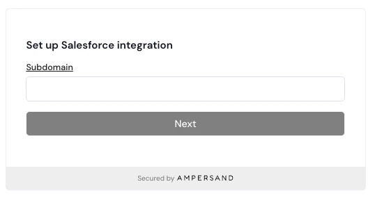
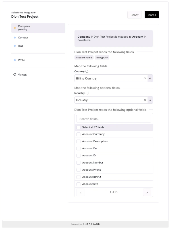
TheInstallIntegration component prompts your customer for their SaaS credentials, and then guides them through the installation flow for an integration. If they’ve already installed this integration, then the component will display the current configuration of the integration and allow them to update it.
Please note that each group is able to install the integration once, so if someone else with the same groupRef has already installed the integration, then the user will not be able to install the same integration again.
The parameters of the component are:
- integration (string): the name of an integration that you’ve defined in
amp.yaml. - consumerRef (string): the ID that your app uses to identify this end user.
- consumerName (string, optional): the display name for this end user.
- groupRef (string): the ID that your app uses to identify a company, team, or workspace. See group.
- groupName (string, optional): the display name for this group.
- onInstallSuccess (function, optional): a callback function that gets invoked after a consumer successfully installs the integration.
- onUpdateSuccess (function, optional): a callback function that gets invoked after a consumer successfully updates an existing integration with the new configuration.
- onUninstallSuccess (function, optional): a callback function that gets invoked after a consumer successfully uninstalls the integration.
- fieldMapping (JSON): a JSON object that specifies the dynamic mapping configuration for this installation. Learn more about dynamic mapping here
onInstallSuccess and onUpdateSuccess should be functions with the following signature: (installationId: string, config: Config) => void. Config is an exported type from @amp-labs/react.
1
Your end user connects their SaaS instance.
2
They configure the integration's objects, fields, and mappings.
Wizard mode (Beta)
The wizard mode replaces the standard configuration view with a guided, multi-step installation flow during initial set up. It walks your end users through connecting, selecting objects, configuring fields/mappings, and reviewing before creating an installation.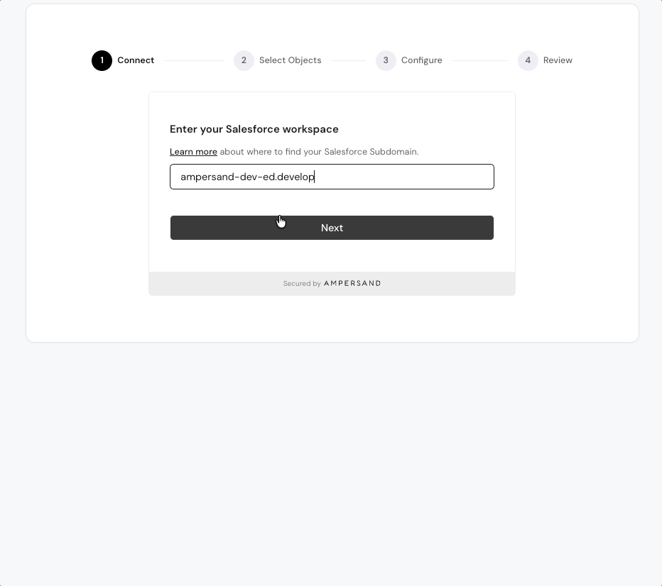
variant="wizard" to the InstallIntegration component:
Connect provider
The ConnectProvider component allows your customer to put in their SaaS credential, but does not lead them through the installation flow. After their SaaS credential is persisted by Ampersand, you can then make an API request to the CreateInstallation endpoint. The parameters of the component are:- provider (string): the name of the SaaS provider, such as “salesforce”.
- consumerRef (string): the ID that your app uses to identify this end user.
- consumerName (string, optional): the display name for this end user.
- groupRef (string): the ID that your app uses to identify a company, team, or workspace. See group.
- groupName (string, optional): the display name for this group.
- module (string, optional): the module to use for this connection. Determines which module-specific metadata to collect from providers that have modules defined. Falls back to the provider’s default module if not specified, and is ignored if the provider does not have modules. If a connection already exists but is missing metadata required by the specified module, a prefilled metadata form will be shown automatically. Supported in
@amp-labs/reactv2.12.1+. - redirectUrl (string, optional): if provided, the page will be redirected to this URL once a consumer successfully connects. This can either be an absolute or relative URL.
- onConnectSuccess (function, optional): a callback function that gets invoked after a consumer successfully connects.
- onDisconnectSuccess (function, optional): a callback function that gets invoked after a consumer successfully disconnects.
onConnectSuccess and onDisconnectSuccess should be functions with the following signature: (connection: Connection) => void. Connection is an exported type from @amp-labs/react.
| Connect | Success |
|---|---|
| 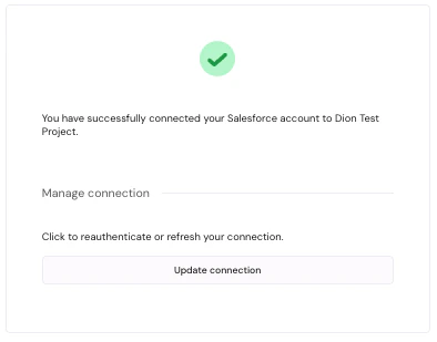 |
Hooks
Check if integration is installed
We provide a hookuseIsIntegrationInstalled to check if an integration has been installed yet for this group. It takes the following parameters:
- integration (string): the name of an integration that you’ve defined in
amp.yaml. - groupRef (string): the ID that your app uses to identify a company, team, or workspace. See group.
- consumerRef (string, optional): the ID that your app uses to identify this end user. If you are using JWT authentication, you must provide this parameter, or ensure that this hook is called inside InstallationProvider. This parameter is supported in
@amp-labs/reactv2.10.1+.
- isLoaded (boolean): indicates whether the API call has resolved.
- isIntegrationInstalled (boolean): indicates whether the integration has already been installed by somebody in the group.
- isError (boolean): indicates whether an error occurred while fetching the integration or installation data.
- error (Error | null): contains the error object if an error occurred, otherwise null.
- config (Config): the configuration object for the installation (see below for usage examples).
Using with JWT authentication
If you are using JWT authentication, you must provide theconsumerRef parameter, or ensure that this hook is called inside InstallationProvider.
Check if specific objects are installed
Currently, the InstallIntegration component will create anInstallation as soon as the user saves a single object. This means that when
useIsIntegrationInstalled returns true for isIntegrationInstalled, not all objects would have been configured and saved yet.
If you need to know when all objects or specific objects are installed, inspect the Config object.
Customize styles
To customize the look and feel of Ampersand components, import your own CSS file directly after@amp-labs/react/styles.
You can override CSS variables that are exposed in the variables.css file. By convention, CSS variables that are used in the Ampersand components are named with --amp as a prefix.
Example App.css
App.css
Dark mode
Ampersand’s UI components support dark mode. Ensure that you have the following lines in your application’s CSS:Migrating to v2
@amp-labs/react v2.x.x no longer requires Chakra as a dependency, and also provides users with the ability to customize styles. When upgrading from v1.x.x. to v2.x.x, you must add an additional line after importing the library:
Troubleshooting
Why did installing or updating fail with a field error?
When a customer creates or updates an installation, Ampersand runs a sample read against the provider before saving. If a selected field isn’t visible to the connected user, or a field name doesn’t exist on the object, the install is rejected and the component shows the provider’s error message. Your customer can fix it in the flow — for example, by granting field access — instead of hitting a broken sync later. This runs automatically on@amp-labs/react 2.13.5 and later. Older versions show only a generic error, so upgrade for the detailed messages. See Install-time validation for the full behavior.